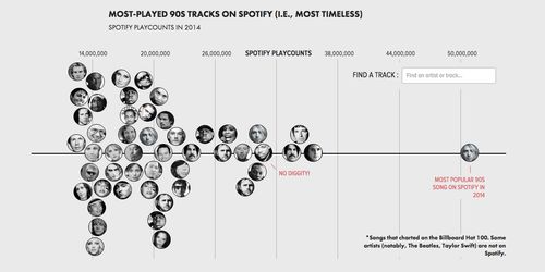
Using Spotify to measure the popularity of older music

Using Spotify to measure the popularity of older music
9/29/2015
link
summary
The website at http://poly-graph.co/timeless/index.html is a visualization project that explores the concept of time in various forms. It presents a series of interactive charts, graphs, and animations that depict topics related to time, such as the history of written language, the lifespan of famous historical figures, and the evolution of technology over time. The visuals are accompanied by brief explanations that provide context and additional information. The project aims to showcase the passage of time in a visually engaging and thought-provoking way, offering a unique perspective on the concept of time.
tags
visual storytelling ꞏ data visualization ꞏ interactive design ꞏ information design ꞏ data analysis ꞏ temporal data ꞏ timeline ꞏ chronology ꞏ history ꞏ historical events ꞏ historical data ꞏ historical analysis ꞏ data representation ꞏ narrative visualization ꞏ time visualization ꞏ data journalism ꞏ infographic design ꞏ user experience ꞏ digital storytelling ꞏ interactive storytelling ꞏ interactive website ꞏ visual communication ꞏ information architecture ꞏ data exploration ꞏ data interpretation ꞏ data presentation ꞏ data storytelling ꞏ storytelling techniques ꞏ data-driven storytelling ꞏ storytelling with data ꞏ data visualization tools