Why Do All Websites Look the Same?

Why Do All Websites Look the Same?
4/7/2019
link
summary
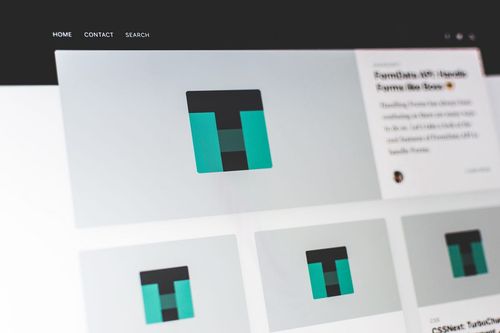
This blog post discusses the concept of visual weariness on the web and how the current design trends contribute to it. The author explores the excessive use of imagery, animations, and gradients that have become prevalent in web design. They argue that this visual overload can lead to fatigue and a lack of engagement from users. The article suggests that simplicity and minimizing visual distractions can help combat visual weariness and create a more enjoyable user experience. It encourages designers to prioritize clarity, usability, and meaningful content over excessive visual embellishments.
tags
web design ꞏ visual fatigue ꞏ user experience ꞏ digital exhaustion ꞏ information overload ꞏ visual aesthetics ꞏ cognitive load ꞏ digital design ꞏ graphic design ꞏ visual elements ꞏ color psychology ꞏ typography ꞏ layout ꞏ readability ꞏ user interface ꞏ user interface design ꞏ web development ꞏ internet culture ꞏ digital media ꞏ screen time ꞏ eye strain ꞏ visual pollution ꞏ minimalism ꞏ simplicity ꞏ visual hierarchy ꞏ visual noise ꞏ design trends ꞏ accessibility ꞏ visual impact ꞏ visual balance ꞏ visual appeal ꞏ visual overload ꞏ digital visuals ꞏ digital experience ꞏ visual satisfaction ꞏ visual stimulation ꞏ design principles ꞏ user-centered design ꞏ color palette ꞏ whitespace ꞏ navigation design ꞏ visual rhythm ꞏ visual composition ꞏ visual consistency ꞏ visual harmony ꞏ visual order ꞏ visual perception ꞏ design fatigue ꞏ visual trends ꞏ design psychology ꞏ visual storytelling ꞏ visual communication ꞏ visual branding ꞏ visual style