The most misleading charts of 2015, fixed

The most misleading charts of 2015, fixed
1/2/2016
link
summary
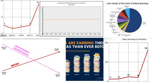
This article discusses some of the most misleading charts of 2015 and how they have been fixed to accurately depict the data. The author highlights various types of misleading charts, including ones with distorted scales, exaggerated proportions, and misrepresentations of data. Using specific examples, the article explains how these charts can manipulate the reader's understanding and perception of information. The author then examines how these misleading charts were corrected, either through data visualization improvements or through the use of clearer and more accurate representations. The article concludes by emphasizing the importance of presenting data honestly and accurately to maintain trust and ensure informed decision-making.
tags
data visualization ꞏ charts ꞏ misleading charts ꞏ data interpretation ꞏ data accuracy ꞏ infographic ꞏ data analysis ꞏ statistical analysis ꞏ information design ꞏ visual communication ꞏ data journalism ꞏ information graphics ꞏ data representation ꞏ data manipulation ꞏ data misinterpretation ꞏ data presentation ꞏ chart design ꞏ data integrity ꞏ data storytelling ꞏ data visualization techniques ꞏ deceptive charts ꞏ visual deception ꞏ data visualization best practices ꞏ data visualization mistakes ꞏ misleading data ꞏ data visualization ethics ꞏ data literacy ꞏ data communication ꞏ data bias ꞏ misleading statistics ꞏ data distortion