How the Web Became Unreadable

How the Web Became Unreadable
8/9/2017
link
summary
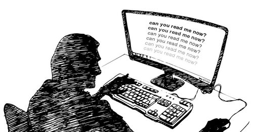
This article discusses the increasing difficulty of reading text on the web due to poor typography choices. It highlights the shift towards using low contrast color schemes, small font sizes, and unconventional layouts which make it harder for users, especially those with visual impairments, to read the content. The article delves into the history of typography and how traditional print design principles have been neglected in web design. It also examines the reasons behind this trend, including the rise of mobile devices and the desire for minimalist aesthetics. The author argues for a return to legible typography to improve the user experience on the web.
tags
web design ꞏ readability ꞏ typography ꞏ legibility ꞏ user experience ꞏ web accessibility ꞏ digital text ꞏ reading habits ꞏ visual design ꞏ information design ꞏ user interface ꞏ screen readability ꞏ font choice ꞏ design trends ꞏ visual hierarchy ꞏ contrast ꞏ font size ꞏ line spacing ꞏ serif fonts ꞏ sans-serif fonts ꞏ responsive design ꞏ mobile optimization ꞏ user-centered design ꞏ cognitive load ꞏ eye strain ꞏ text legibility ꞏ font readability ꞏ user engagement ꞏ web development ꞏ user interface design ꞏ typographic hierarchy ꞏ information overload